It’s easy to neglect a key part of a prime customer experience when you spent so much time optimizing another part of it. The Shutterstock logged-in homepage was a victim of that until it wasn’t.
- Things I did
- UX, UI, strategy, user research, usability testing, prototyping, user flows, developer handoff and QA
- Tools I used
- Sketch, Framer, UserTesting, Jira, HTML/CSS/JS
The challenge
Re-imagine the logged-in homepage experience for the e-commerce Shutterstock customers to increase conversions and customer lifetime value while maintaining access to long-available, vital features.
My role
I spearheaded the core strategy and led all design and user research efforts over several months. I collaborated very closely with product managers, designers, engineers, creative marketers, and customer care associates, among others.
The wake-up call

While conducting user research on a separate issue, we discovered that our e-commerce customers were very indifferent about the Shutterstock logged-in homepage. They described it as boring; underwhelming. Customers said that "it feels more like an account page than a homepage," and, "I only come here to search."
In light of this feedback, we conducted follow-up, in-depth user research with a focus on the logged-in homepage experience, after which we went through several rounds of design and usability testing to arrive at final designs for a brand new logged-in homepage experience. Read on for the details.
One step at a time
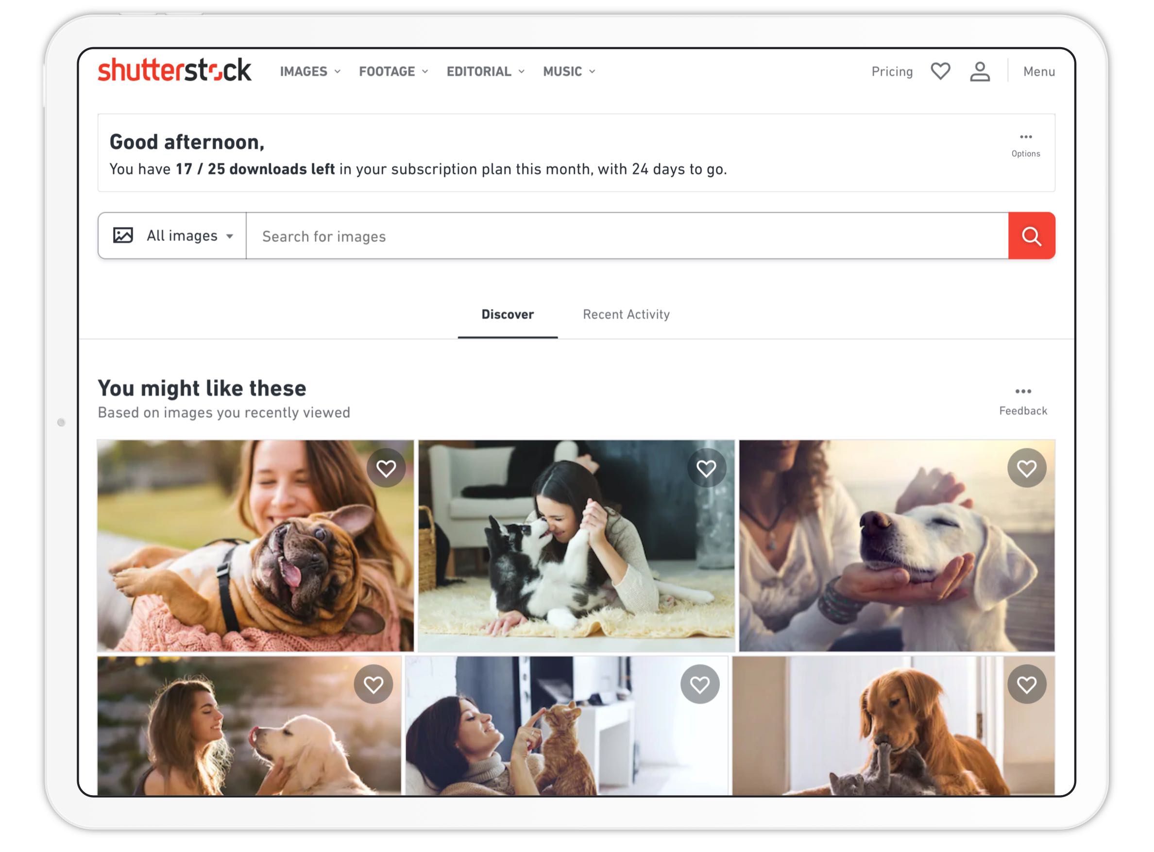
The first round of user research not only confirmed the earlier findings, but, more importantly, helped us more fully understand how Shutterstock customers used their homepage, and how they didn't. This in turn helped us generate hypotheses around how customers' use of their Shutterstock homepage (consistently, the most high-traffic jumping-off point for search and discovery) could evolve to provide access to personalized discovery paths so that the homepage is no longer just a placeholder for the search bar.
Can we get customers to follow alternative discovery paths that will also lead to downloads? Will that speed up their search and discovery process? Will it be helpful for those customers who have difficulty coming up with the right keywords to search by (a known challenge for our international audience)? Can we shift the mode of discovery from textual to visual? And, collectively, will these experiences lead them to keep coming back for more, leading to higher lifetime customer value and retention rates?
The timing was good because we were in the middle of migrating key customer experiences over to a new tech stack, on a new design system. So, taking advantage of a new design language, we set out to design this new, personalized logged-in homepage.
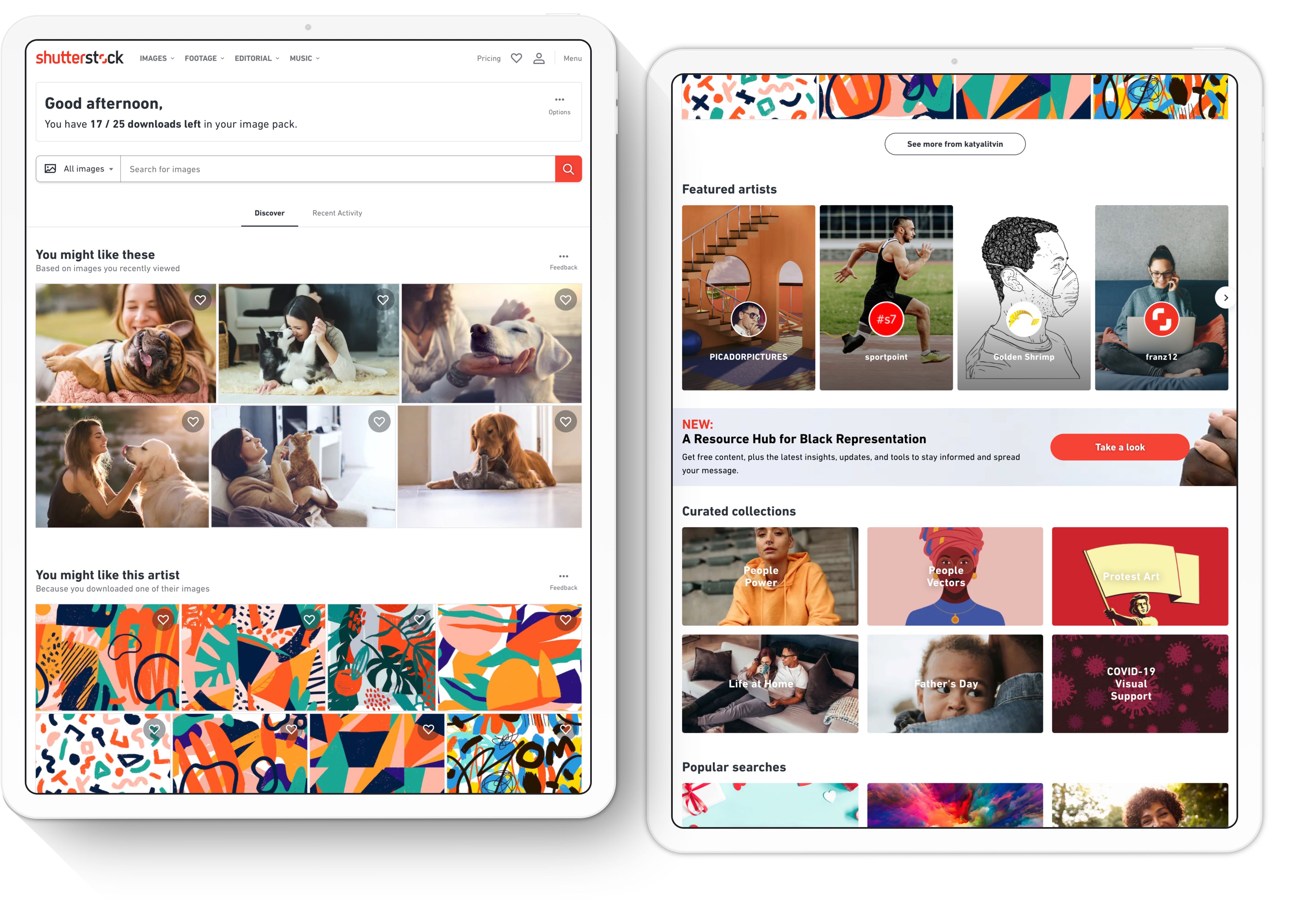
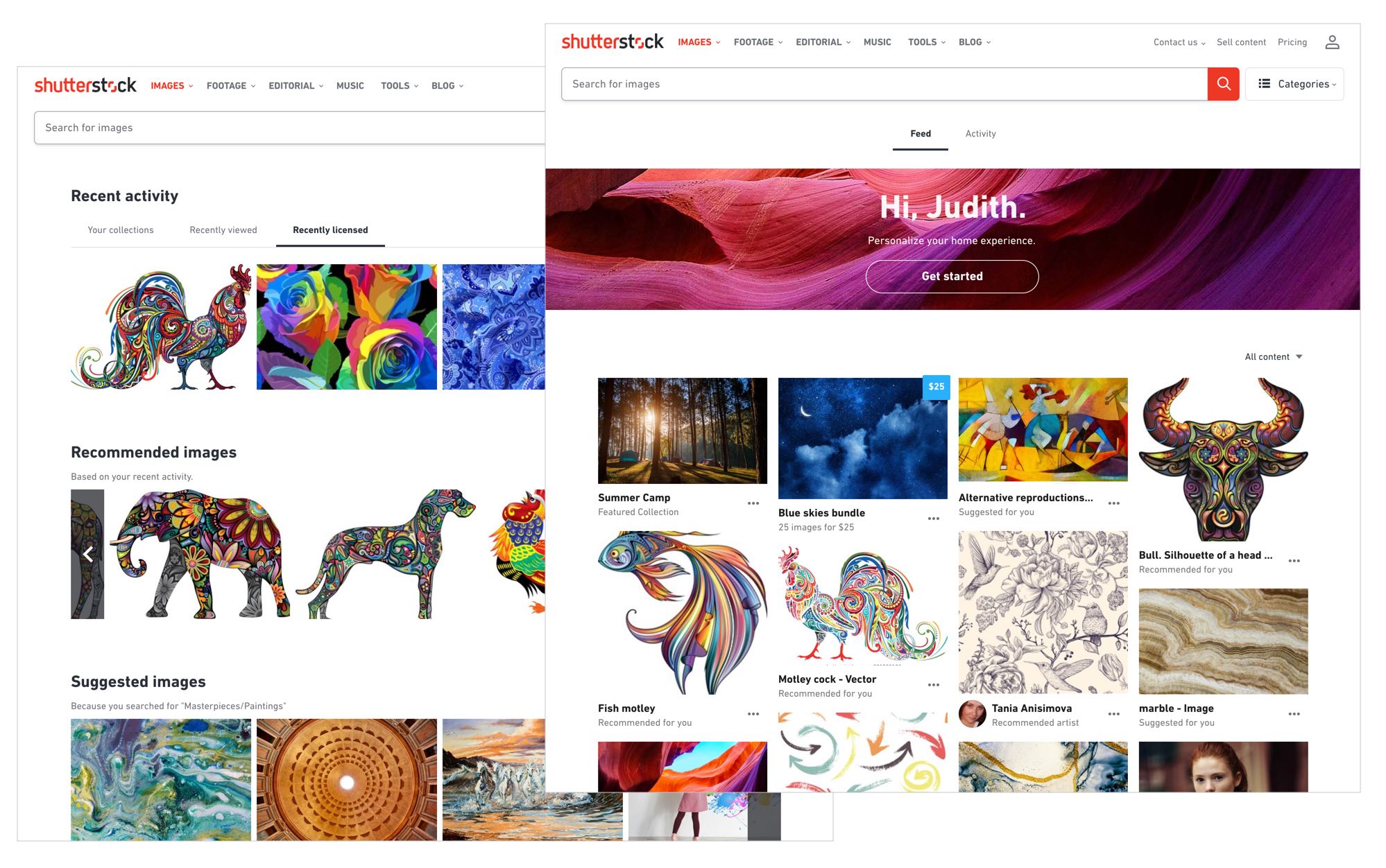
Netflix or Pinterest?
Personalized content recommendations were new territory for Shutterstock and not a common practice for the stock content industry. We looked at examples outside of our industry, and in doing so, anchored our early designs on what we dubbed as the Netflix model and the Pinterest model. We decided to test two distinct design concepts, with personalization being the common denominator.
The feedback was mixed: both had their pros and cons, according to customers, but what was clear was that most welcomed the personalization. We decided to focus on iterating on the Netflix-like concept, which was more feasible at the time from a technical point of view.
Taking stock* of what we can and can't do
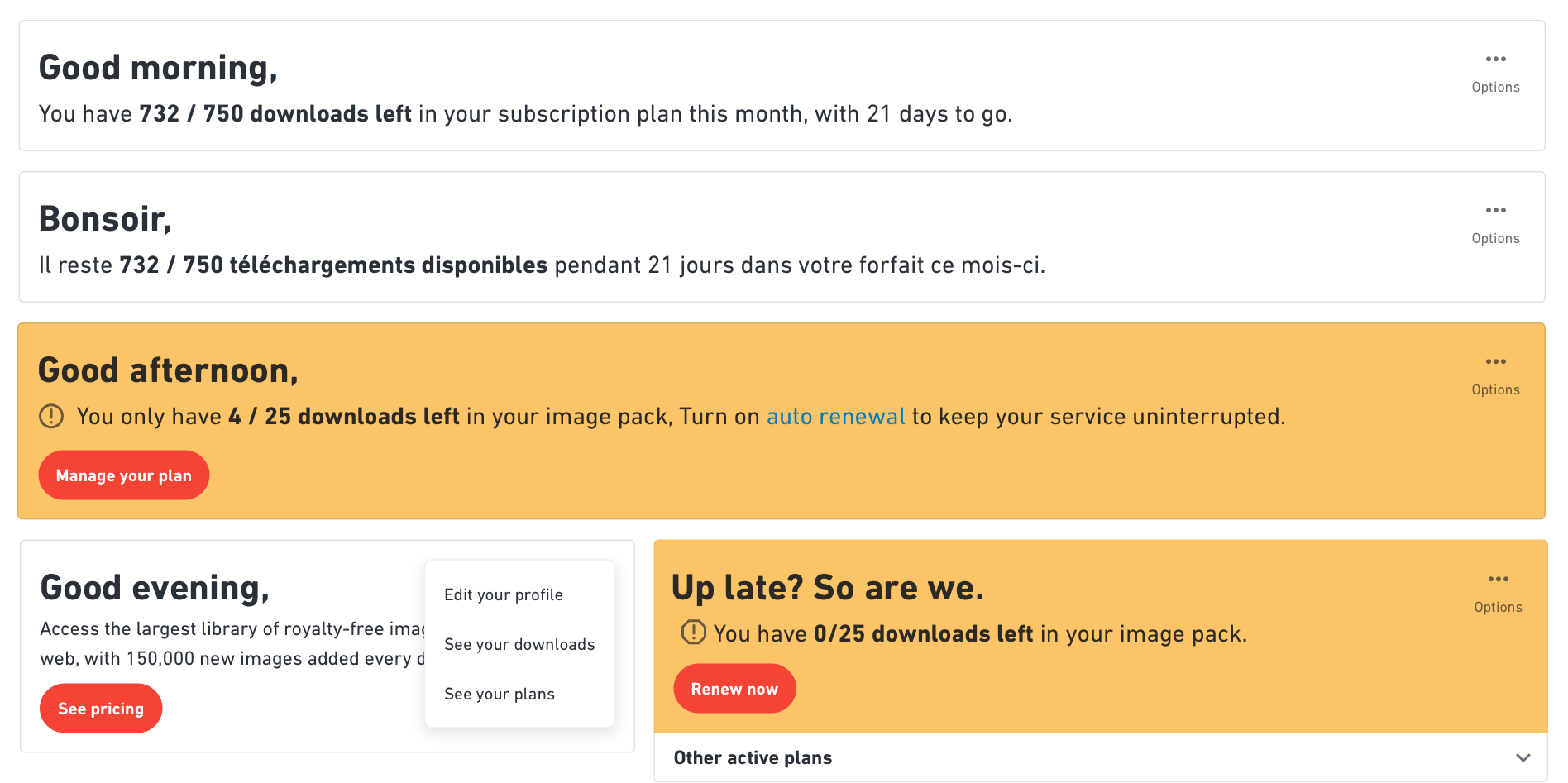
In an ideal scenario, the backend team is ready and available to uncover or deliver robust algorithms for fail-safe personalization. The reality was much different; we had but one such algorithm to lean on, and we had to get creative with the rest. We went on to devise personalization recipes, of which the ingredients were nothing more than a series of API calls to produce meaningful results.
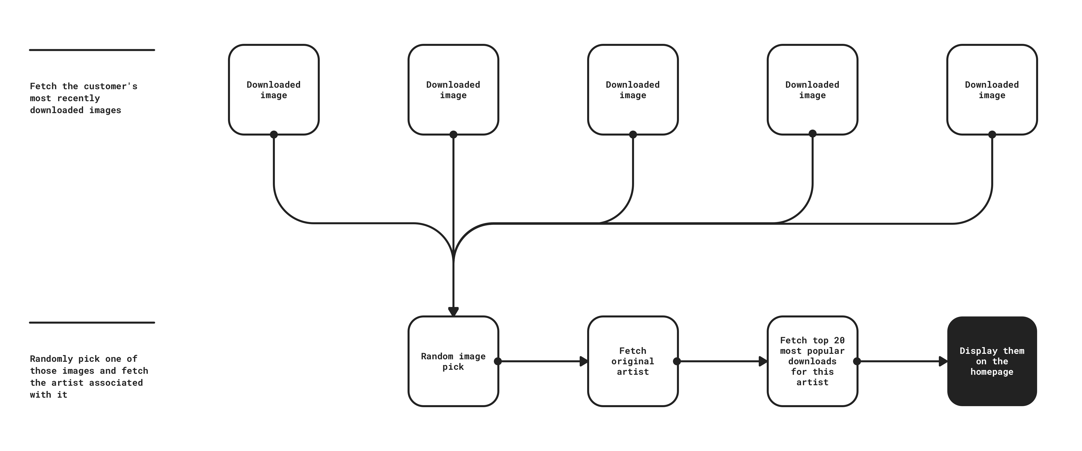
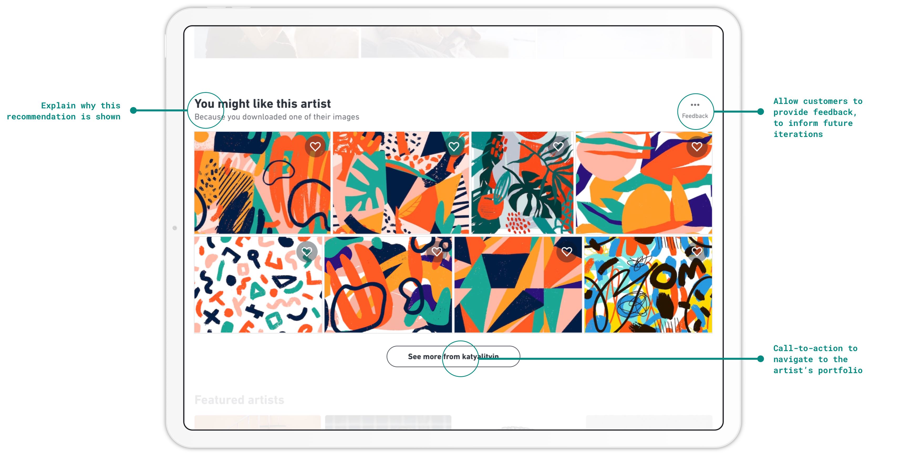
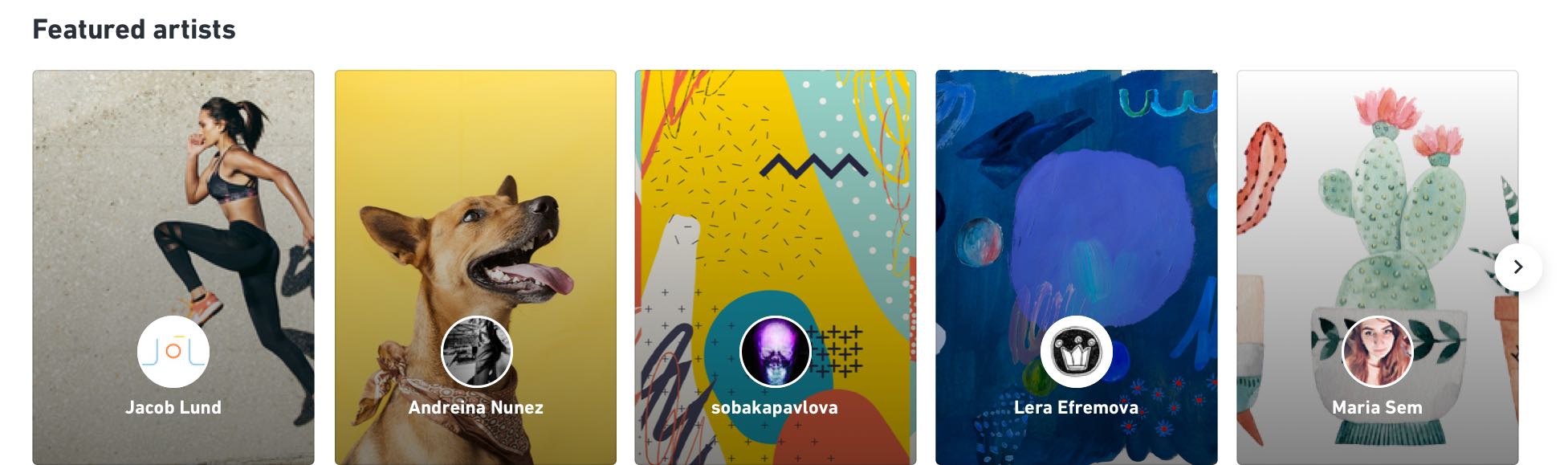
For example, we knew that customers liked to explore and come back to artist portfolios that matched their preferred styles and themes. We made a hypothesis that customers would be interested in having artists recommended to them that they had previously downloaded content from, and that formed the basis of our artist recommendation recipe.
We came up with other hypotheses using the same method, simplified them for an MVP release, and kept the more ambitious ones filed away to come back to later. Ultimately, we knew that our recipes were rudimentary and wouldn't always be successful. The goal was to prove the value of personalized content to our senior stakeholders so that we could invest in making improvements.
* That pun was not intended, but let's pretend that it was!
No more heroes
We knew going into the design that convincing customers to consistently engage with anything on the page other than the search bar was ambitious — at that time, approximately 75% of actions taken on the homepage related to the search bar, and that to shift that metric we had to make bold decisions. So we did something unconventional: we shunned the large hero pattern that all landing pages across Shutterstock had previously adopted, to pull up, place focus on, and call attention to the recommended content just below the search bar.
Design UI, test UI, rinse and repeat
After having solidified the strategy, we focused on the user interface design, introducing several new components to our design system to realize the vision for this page. At this point, I worked closely with our design system ops team to ensure that the new components would be ready when needed and that the design documentation and specs were thoroughly vetted.
Where necessary, I created interactive prototypes in code to demonstrate key parts of the user experience, such as this prototype, which demonstrated how the page's loading states would function.
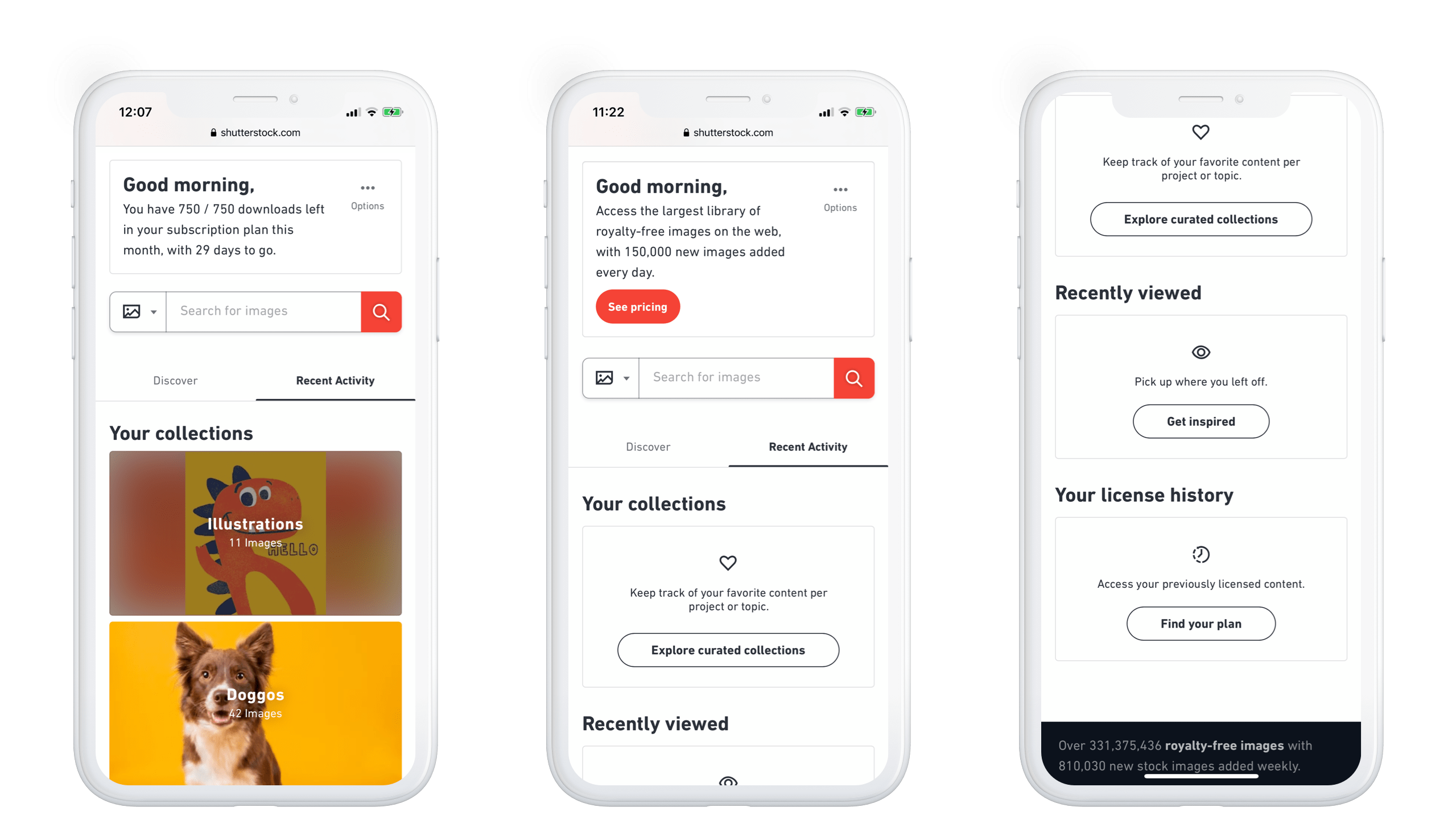
Concurrently, we conducted several usability tests to test our assumptions on the key interaction patterns. For example, will customers be able to locate their recent activity tucked away under a tab? (Turns out they were, to our relief.)
Post-launch data tracking and user research
Following the launch of the new homepage, we kept a close watch on how it was performing by monitoring engagement with the page using extensive click tracking, as well as collecting qualitative user feedback via the on-page feedback mechanism and ad-hoc user interviews.
Since launch, the personalized recommendation modules have accumulated a significant number of clicks. Below are three key metrics that we tracked to gauge engagement and plan iterations.
- 15.8%
- customers clicked on a personalized discovery module
- Since launching the redesigned, personalized homepage in late 2019, 990k (out of ~6 million) users had used the personalized discovery modules as of 2020 Q2, which number accounted for 15.8% of customers to the homepage at that time.
- 41%
- download conversion rate
- Of the users who clicked on the personalized discovery modules, 41% of them went on to download at least one image in that same period. This astounding statistic represents the highest, by far, conversion rate, ahead of search filter usage (23% of those who use search filters end up downloading).
- 135K
- zero search downloads
- By the end of 2020 Q2, more than 135K downloads resulted from zero search sessions, driven by the homepage. This is significant in that not a single search query was typed into the search bar before the download event, and is especially exciting and encouraging for international audiences who sometimes struggle to find the right keywords to search by, as mentioned earlier.
Closing thoughts
The personalized logged-in homepage was the first of its kind for Shutterstock. I relished in the experience of being able to lead and rally my team and all major stakeholders behind the ambitious vision we set out to realize. It was the project that solidified for me that deeply understanding the customer is what leads to uncovering the most long-term, revenue-driving opportunities for growth and innovation.